Saturday, June 27, 2009
Zoya Angel
I found few older pics of some pinks in my hard drive. Zoya Angel is one of my favorite pinks, very soft and super flattering to my skintone. The base shade is dusty rose with a hint of mauve in it. The polish is packed with shimmer that seems to be a mix of pink and perhaps pale gold or silver with warm tinge. The overall impression is grayed rose in my eyes. In the bottle the shimmer is very dominating, but on the nail this color can be surprisingly cremelike, especially in indirect light.
The light in the picture is warm indirect evening light and it gives a little too warm impression of this color - although it really has a beigeish nature in warm light. The bottle image gives a good impression of the color in more cool light.
This polish can be used with just one sheer layer or 2 to 3 layers for more opaque look. The consistency is thin and fast drying, easy to work with if you don't try to make thick coats.
Thursday, June 25, 2009
Half moon mani attempt with Opi Time-Less is More and Color Club Fast Woman
The half moon manis have been bubbling around - at least in burlesque circles. Dita von Teese has been sporting the style quite a lot.
And lately the half moon circles have been seen in the runway, too: in Dior, Thakoon, Ruffian...
The manicure definitely has the retro vibe in it. The origins of this style are on 30's and 40's. Personally I remember seeing it first long time ago on Imelda Marcos in some magazine. Images of Imelda, her perfect manicure and several thousand pairs of shoes was contrasted to strong photography from Manila protests for 1986 election...
As you can see, my first half moon attempt was not an immediate success, but I definitely learned something in the process.
I started with two coats of Opi Time-Less is More, this is nice cool but soft shade of white. The two coats i used here were perhaps bit too sheer for this purpose. The red polish is Color Club Fast Woman, a rich deep cool red. For some reason this polish is really hard to photograph, it easily looks brown based.
On the pinky I tried freehand application - a total disaster, I did not even bother to clean up the mess. On ringfinger I tried a paper guide - it bled. On middle and forefinger I went back to freehand method, but this time I rolled the finger I was painting instead of trying to achieve the shape with brush stroke. This provided quite decent results.
For line painting it is essential that there is not too much polish in the brush. But after creating the arch shape you need quite a thick coat of color to disquise the stroke painted to vertical direction. Add the top color immediately after the stroke so that the vertical stroke still blends to the color area. A thick coat can be easily applied close to the color border, the vertical stroke will act as a light barrier for bleeds if you are careful. The blending is not perfect in the previous image, but I made another round with better success. I'm sure that practise will help with this.
And few random thoughts and ideas about this kind of mani. For top colour I would pick shades that are decent looking with just one thick coat - the half moon circle will not get prettier with several applications of top color. The classic way is to use pale base and strong contrasting top color, but I quess that inverting the colours could be nice effect. I can easily see the half moon mani done with more subdued shades - or bright contrasting ones - and different textures could be utilized as long as the base shade leaves a surface smooth enough to work with - a rough glitter base might not be the best idea. I would not try to paint the moon over the main color, but with steady hand and small decoration brush even that could be possible.
Glamour magazine has a clever trick for half moon manis, the editor uses the paper hole reinforcement stickers as guides for the half moon. I certainly will try this, although I think that the guides usually create a little too harsh edge between the colors. Plus one has to wait the base color to be completely dry before applying the stickers, otherwise the stickers will ruin the base.
I guess that the best results could be achieved by shaping the arch with small, sharp brush and remover afterwards leaving the half moon area bare (that's the classic way to go) - but of course then I could not use two polish colors for this. And I quite enjoy the strong contrast that the white base creates... Maybe I just purchase a separate precision brush, perhaps a small slanted one for painting the first line with dark polish? Or maybe a thin one with long and flexible bristles would be even better? That kind of extra brush might also help with french tips and cuticle cleaning... ...perhaps I should take a closer look to my artists brush collection!
Wednesday, June 24, 2009
NYX Hawaii & Seche Vite in test
There are some polishes those I wished they would work - but they just don't. One of them is NYX Hawaii, a beautiful pale blue that leans slightly to aqua. I'm a bit confused about the finishes, in the past I would have definitely called this kind of color pearl, but I see that many brands call them frost.
I like pastels in general and this particular shade of blue always catches my eye. The problem with this polish is that it is awfully sheer. With one coat I get a subtle layer of shimmer that looks almost white. I could use this as part of funky french manicure, I think that the effect might be quite cool.
Streakiness is typical for this kind of colors and this is not an exception. I'm not skilled enough to avoid it totally, but very thin, carefully applied coats keeps the streaking in acceptable levels...
Second coat starts to build the color a bit, but this is still far from the bottle color. This is probably the ugliest phase, the application looks very uneven and the pale blue is not particularly flattering in semi sheer.
Third coat helps a lot, but it is not opaque enough to my taste. This is usually my breaking point, manis over three coats are just too much for me plus the strenuous application off this particular color really turns me off. But because I wanted to test Seche Vite in real action I still added one thin coat more - and the fifth thicker coat to my thumbnail just for curiosity.
This is the result with four coats and one thick coat of Seche Vite. This polish has good shiny surface by itself, but clear and very shiny coat of Seche still adds some dimensionality to the finish. It is extremely difficult to capture that in the images, though.
Seche did excellent job with four thin coats of this polish. I got one bubble to one nail, but I had just carried the bottle in my purse and there were some bubbles in the top coat, this one I noticed too late to brush it away. Ten minutes from the application of Seche the nails were ready for light work.
On thumbnail the five coats were too much for Seche. The dryer penetrated only the top layer of polish and dried that in a snap - but now I had a dry layer of polish over completely wet layer; extremely vulnerable for dents. I added one more ample coat of Seche and witnessed a curious phenomena: the whole polish layer wrinkled to funny, organic looking micro folds. But the wrinkles started to disappear while Seche dried, and to my surprise I got almost perfect finish to my thumb, too (minus the dent, I tested the dryness too vigorously).
So Seche Vite is good stuff in my books. Of course I have to test it with other brands, too.
About Hawaii, I would love to love it.
I mean what isn't there to love in these glowing, cyborg-chic tippies? It's the application, that is just too much for me...
Monday, June 22, 2009
China Glaze Rodeo Fanatic
Old news is good news in this blog... Rodeo Fanatic is my first and only color from China Glaze's Rodeo Diva collection. I have been very hesitant to try this on, it looks all too flashy in the bottle. Shimmery, tealish blue with quite strong purple flash, from the bottle I would judge this borderline duochromatic. Ouch!
But on the nails this is fabulous, blackened enough to be stylish, but definitely blue in different lighting. The purple flash seems to almost disappear on the nail, it only makes the color less teal looking in some light. On the other hand the warm shades of artificial light brings the teal shade up nicely. This is Rode Fanatic in indirect natural light:
Sunlight really shows the beautiful shimmer.
But the best thing with this color is the application, it's flawless. I really dig CG brush, not too small, not too big - just perfect. And the best for last: this is one coater on my short nails, longer ones might benefit from two.
Sunday, June 21, 2009
A polish with double personality: BB Couture Opposites Attract
Lately I have swatched all but summery colors - but today I'm happy I did. BB Couture Opposites Attract has a weird double nature that is fully revealed in full sunlight. In indirect light the polish can almost pass as cool medium gray creme. Just a hint of unevenness suggests other.
There is quite a load of glasslike crystal shimmer packed in this polish, plus some deep blue shimmer, seen as almost black dots in indirect light. The shimmer is extremely difficult to capture to photograph, but it reminds me a lot of China Glaze glass shimmers (for example White Qvik Silvr).
Nah, this does not show the shimmer as I wished it would.
Consistency was perhaps a bit watery, but the polish is well pigmented and fast drying, definitely a two-coater. I really like all BB Couture polishes I've tried so far.
My topcoat on the other hand is almost finished, thick and gooey, bubbly, annoying to apply and almost ruins the manicures. A bottle of Seche Vite is on its way to here!
Wednesday, June 17, 2009
Manglaze The Death Tar
Manglaze-manis make me truly happy.
After the gorgeous Fuggen Ugly I was a bit hesitant to try the black version - it's ordinary black after all, huh, can't be as beautiful and extraordinary than FU.
Well, I was wrong. Death Tar is gorgeous in it's own right. I love this less loud than shiny black, velvety, secretly shimmery, stealthily mean look. Perfect application, this is two coats.
Excuse my purple stained fingers...
Sunday, June 14, 2009
BB Couture for Nails, Blind Love
More metallics! I've had Chanel Caleidoscope, a gorgeous greenish shade of silver - and I lost it. Some time ago I cleaned up my nail polish stash leaving just few favorite shades. I'm certainly sure that I was not about to banish the beloved Caleidoscope, but something strange happened and I have not been able to find it since. This spring I got an urge to find a duplicate to it - I'm not paying the eBay prices from the original.
BB Couture Blind love comes satisfyingly close. It has the same foil like finish, but the sunlight reveals a super sparkling shimmer of this color. The color is beautiful, slightly oxidised shade of silver. In my memories Caleidoscope was slightly greener, but I guess that I can settle with Blind Love.
Application of this polish is really good, it gives surprisingly smooth surface with no bad brush stroke stripes and dries fast. This is two coats without top coat. I guess that it is only the memory of beloved Caleidoscope that prevents me to use the tag "Great" in conjunction to this color.
Working with color - complementary colors
I have no background in makeup artistry or fashion, but I've been working as a graphic designer / art director for about ten years - and now I have year and a half of fine art studies on my back pocket. So I have been working with color quite a lot - why not write something about it.
Combining colors can be quite instinctive for some people, but if you feel insecure there are always the basic tool to get started with: the color wheel, familiar probably for all of us.
Most people feer very combortable when combining color siblings or analogic colors: colors that are located next to each other in color wheel. Complementary colors, however, might feel more challenging. Complementary colors are located opposite each other. To get little bit more out of this little exploration I will choose not just plain single complement pair, but analogic scheme from blue to purple plus complementary accent color from the other side of the wheel. It looks like this.
I know that there are at least of some people who really can rock color schemes like this. But usually it needs quite strong colors in hair, skin and eyes - plus lots of courage. The task will get easier when the other parameters of color are adjusted as well. I pick the four brights from this complementary palette and adjust the saturation in one row, lightness in other.
Wow, much more manageable! Of course it is possible to adjust both, saturation and lightness at the same time. And adjust the lightness towards the dark end. The whole set is not meant to be used together, but from here you can easily pick few colors that nicely complement each other.
And here's a real life implementation of this palette. I actually wore this last week (but forgot to photograph the deliciously yellow nails):
Deep, super saturated blue tights from We Love Colors, an old H&M dress in particularly uggly-attractive shade of yellowish pale brown plus cheap and cheerflul Rimmel nail polish (055 Sunshine) plus some black, white and gold accents.
The dirty shades from the opposite side of the color wheel + just one accent color create particularly easy and attractive combinations, they usually benefit from the freshening touch of white (or off-white) used in the same combination.
Here's another example with coordinating these complements, this time with makeup only. This is not real life experiment, but when I saw the images I knew that I will use this look combined some day. Color Club Catwalk Queen is from the blackened but saturated end of purples.
That manicure would look fabulous combined to simple but bright make-up. I really like eyeliner and don't feel uncomfortable at all to experiment with brights in makeup that relies strongly to eyeliner. I would pick any shade that has yellow component dominating the color, preferably a rich gold in tone (reddish, dirty, greenish, pure, yellowish...) that complements the skin and eye color for simple but festive look.
This is Fyrinnae Lucky Charmed, an incredible metallic finish gold with chartreuse tint. It foils like a dream with water or mixing liquid.
Sorry about the skintone, my camera has fixed settings for white balance, there are lightings when none of those settings quite work. And I'm too lazy to fiddle with RAW images for blog use...
There are many online color wheel tools to play with, try for example the particularly nice and easy Color Scheme Designer.
Saturday, June 13, 2009
Decadently gorgeous Zoya Richelle
This is one of my older nail pics with slightly longer nails. That might be my favorite length, still very practical but starts to have that finger elongating elegance of long nails.
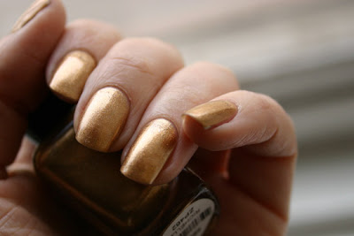
Zoya Richelle on the other hand is one of my favorite metal polishes. The finish is very metallic but not actually foil like, larger sparckling particles disguise the brush strokes really well. The polish is thin, but two coats is enough for opaqueness. In addition to the perfect application I like this warm, slightly copperish, slightly dirty shade of gold.
This might not be the most obvious summer shade, but I really wait to test this out with simple grecian-style draped dress, some bejewelled sandals and light tan.
Alberta Ferretti dress from SS 2008 collection. Style.com
Wednesday, June 10, 2009
OPI Hey Get In Lime
I think that this color has nothing to do with lime... ...but I still love it! It's not the palest and shyest mint green, it has some depth. And there is a slight edgy gray tinge in it - the result is color that is both flattering and unusual. This is three coats, but I'm afraid that with longer nails the tip line would still be visible. Application was easy and drying time reasonable, I definitely will keep this. Mint nails will probably be huge in the autumn, especially if Chanel releases a mint green polish as speculated. Not that I would be too much concerned about being seen in the "it" colors, though =)
See more Chanel RTW detail images at Style.com.
Got to confess that colors like this make me toy with the idea of my own nail polish brand, very centered in color design. It would be fabulous to produce very well thought palette instead of endless arrays of reds and nudes. I guess that Rescue Beauty Lounge is doing this, kind of, but their prices are far off from that price range I usually pay from polish.
Sunday, June 7, 2009
Color philosophy
I see painted nails as an accessory, not necessarily as a touch up or make-up. For that "me, just better"-look I think that well maintained, natural nails do a pretty good job for me. That shiny surface of traditional nail polish always exceeds the boundaries of "natural" somehow. For that reason so called "natural" manicures make me just feel a bit funny, like planting plastic trees to my backyard. Yes, they can look quite natural, from a distance!
So when I color my nails I usually opt to bright, funky colors. I try to complement my outfits and general look with nail polish, and there are much more factors than color of my lipstick that affect to my color choice. There is no official flow chart for color selection for me, but I've noticed some rules of thumb that I tend to use - most of the time.
I combine bright and loud nails with quite natural and light makeup, or light makeup with just one heavy accent. There are two reasons for this - manicure time uses up a big chunk of my maintenance time, so there is usually no time for anything too complicated after that. And I try to avoid "too done" look on me, whatever that means.
I like to contrast my nails to my outfits, somehow. Orange or pink brighten up often my gray or black outfits. If I wear soft colors it is nice to have something shiny and and loud on my nails. When I wear jewel tones I opt for bare nails - or in some occasions bright contrasting colors. Black, charcoal and almost black nails are my safe choice, those I can coordinate to many outfits and looks.
From varnish finishes I go often for opaque cremes, jellies layered to opaqueness, shimmers and some times foiled metal finishes. I hate to remove glitter polishes, plus I think that they are extremely difficult to coordinate to my outfits in satisfying ways, so I don't have too many of those in my stash. Duochromes are not my favorites, either (although there are exceptions in this category) - and holographic polishes are far out from my comfort zone. But matte look is just so totally me, especially in those safe black and gray! My general appearance is 101% feminine and I really like the nice contrast that matte nail look creates to all that excessive femininity...
I don't fancy to purchase whole seasonal collections at all. Of course sometimes there are colors that I especially wait and want, but usually I like to see some real life swatches on several nail types and make my decisions after that. Or I hunt for color with specific mood and don't care if it's new or old, collection or basic selection, popular or rarity. I want to keep my stash size very reasonable, so I tend to recycle my unsuccessful purchases and occasional shade duplicates. So you don't probably see too many news in this blog, but I hope that these images help someone else with those difficult choices and decisions to make.
Nail art is not my thing - too time consuming and too little impact for the time invested. That does not prevent me to admire a well made and exceptional ones on other people's nails. Well, I might do an occasional French manicure with a twist, or I could try a half moon mani with brights, but those really don't count.
Thursday, June 4, 2009
Manglaze Fuggen Ugly
I'm able to figure out several reasons why to get some Manglaze to your stash.
1) These matte, but slightly shimmering colors kick ass.
2) Manglaze customer service kicks ass. My Death Tar and Fuggen Ugly arrived in less than week from US to Scandinavia. That's better than most of the local Internet stores can promise.
3) It really kicks ass that you don't have to wait for all those trendy matte nail polish collections. You can have your matte and ugly nails right now!
4) Application of this polish kicks ass. No issues, whatsoever. This is two coats.
6) This rock chic style kicks some serious ass. If you happen to be a nerd like me it kind of kicks ass to match your nails to the smooth aluminium surface of your beloved MacBook. These are definitely darker, true graphite gray, but oh, they go so well together!
Wednesday, June 3, 2009
Essie Guilty Pleasures
I really like Essie's take on bright reds. This is Guilty Pleasures from summer 2008 collection - a moody shadeshifting coctail of bright pink and radiant coral. Very uplifting, very flattering. Only downside is the pigmentation, this is three layers and I could have added one more for perfect result.
Tuesday, June 2, 2009
Going bananas with Nubar Lemon Sorbet
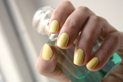
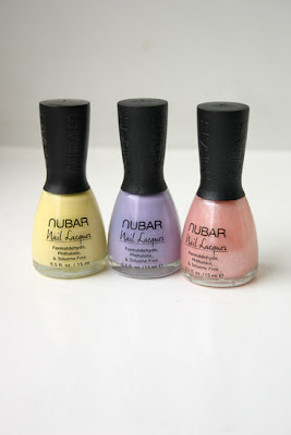
Aww, cute! Oh, edgy! That is my first impression of Nubar Lemon Sorbet. Color is more banana ice cream than lemon sorbet to me, but whatever, I'm liking it (almost licking it)! Probably not the best color for my winter skin, but now when I have slight tan it looks actually quite delicious. Don't mind about the skincolor in this picture, I had to adjust the colors a bit to give a truthful impression of the polish color (and was too lazy to protect the other parts of the image).
Surprisingly nice application and 3 layers were enough for perfect cover. Some bubbling issues that might be due of uncompatible top coat (Trind Quick Dry) or my hasty manicure style. Bubbles appeared surprisingly late, in the image the surface is almost perfectly smooth.
Orange rocks my world - Color Club Orange Revenge
I'm drawn to neon polishes - oranges were the first to catch my eye, but now I'm lemminging more shades. Color Club does good job with neons, this beauty is Orange Revenge, unbelievably bright true neon orange - and surprisingly well covering with just two coats. It really needs a shiny topcoat, it dries almost matte. But when you put on the shine please attach the seat belt and protect your eyes.
Application was not pure pleasure, I don't know why neons tend to be somewhat goopy. But it is definitely not my worst polish to work with - and I really enjoy the eyebrow action this polish creates all around.
I'm warming up for pastels, too. These babies just arrived and I see nail polish removing happening really soon!
Zoya Freja with diamond coat
Recently I have categorized Zoya Freja to metallics rather than greys. It is indeed very silvery, blackened one, not quite with foil finish though. It gives a beautiful futuristic and slightly decadent look and behaves well, covers with 2 to 3 coats. This time I got some sheet marks to couple of nails and end up adding one coat Orly Shine On Crazy Diamond on top of Freja to cover up the mess.
I have to say that although I'm not shy for bright or unusual colors I have issues with excessive bling, mainly with holographic and glitter polishes. I have one holographic polish and I'm seriously considering giving it away - I've barely had courage to try it to my pinkie. But sparsely scattered holographic or glitter particles I like, sort of. They give this funky dotted look, cover nicely some manicure disasters and are so much easier to remove than dense glitter polishes.
I tried to capture the beautiful holographic nature of Orly's topcoat - but that is not too easy. IRL this stuff twinkles like... ...crazy? ...diamond?
Monday, June 1, 2009
Color Club Catwalk Queen
Subscribe to:
Posts (Atom)